BEDROCK ANALYTICS
2018 · Web App · Balsamiq, Sketch, InVision
The Project
Web app to assist sales managers for consumer product goods. Bedrock's' software takes syndicated & retail data (Nielsen, IRI, Spins, Whole Foods, etc.) and transforms it into compelling selling stories for consumer product goods (CPG) sales managers. The software gives sales & marketing managers easy to apply data-based selling stories that are fine-tuned to do three things - sell more products in retail, keep customers' products in retail and find ways to optimize their categories.My Role
When the existing product was moved into the Javascript platform React, it was a good time for a UX and visual design cleanup. I came on board to work directly with the product manager, VP of engineering, and developers on a part-time basis. At that time, the app felt clunky, the UI was not intuitive, and the look and feel were outdated.Challenge
Because we had existing paying customers, we had to be very mindful of not disrupting the service. At the same time, we wanted to give them the best experience possible. So, we decided to break down the project into distinct pieces. This allowed us to work iteratively using the agile development process.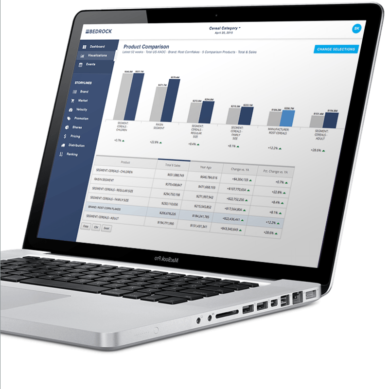
Process
My first project was to simplify the chrome or surrounding "frame" of the app. The goal was to create a more contemporary look and feel while keeping the overall structure. The shades of grey of the current interface felt dull and not on brand, and the icons were hard to read. I also changed some of the UI elements to be more intuitive.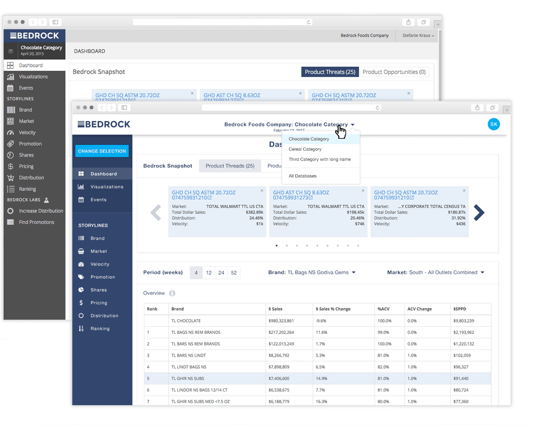
Through analyzing data and talking with our customers, we found that the concept of storylines and selections (choosing products, markets, and metrics to create meaningful insights) was confusing. I looked at the current flow, audited the existing UI, and came up with a set of recommendations.
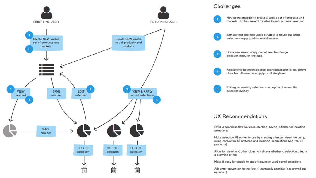
Using a modal overlay for selections meant that users were not able to see how changing the products or markets would affect the chosen visualization.
This was a big problem and resulted in a lot of trial and error. Additionally, a lack of visual hierarchy created confusion.
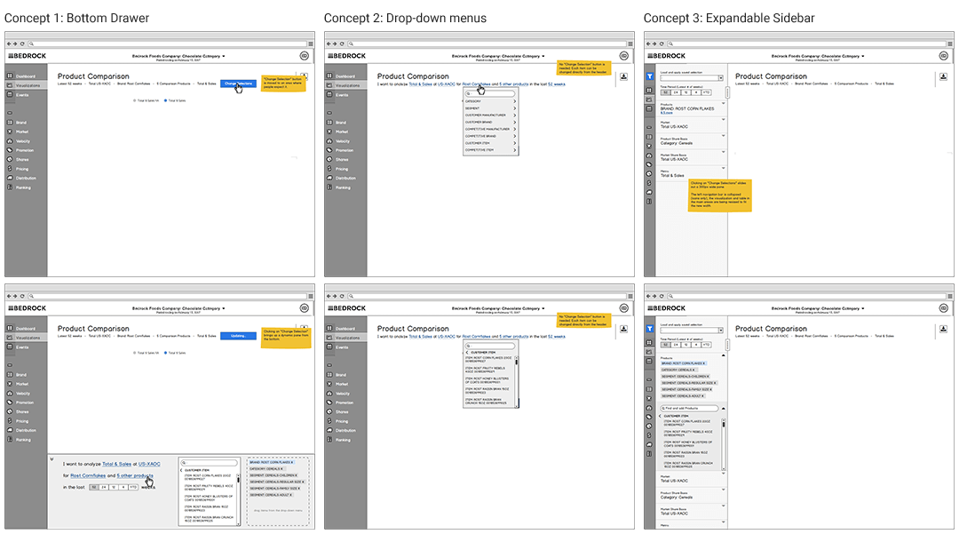
Together with the team, I explored a few ideas on how to make the selection process more intuitive.
Final Outcome
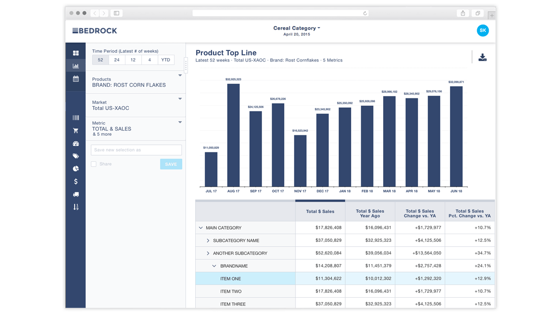
We landed on the left navigation for selections. It's intuitive and allows people to easily change selections while viewing the visualization. This is the solution we implemented, and it resulted in higher engagement for existing companies. Additionally, the new design helped the sales team getting new customers.
