WILDCAT RIDGE
The Project
Branding strategy, website design, implementation and ongoing design work for WildCat Ridge Sanctuary in Oregon.My Role
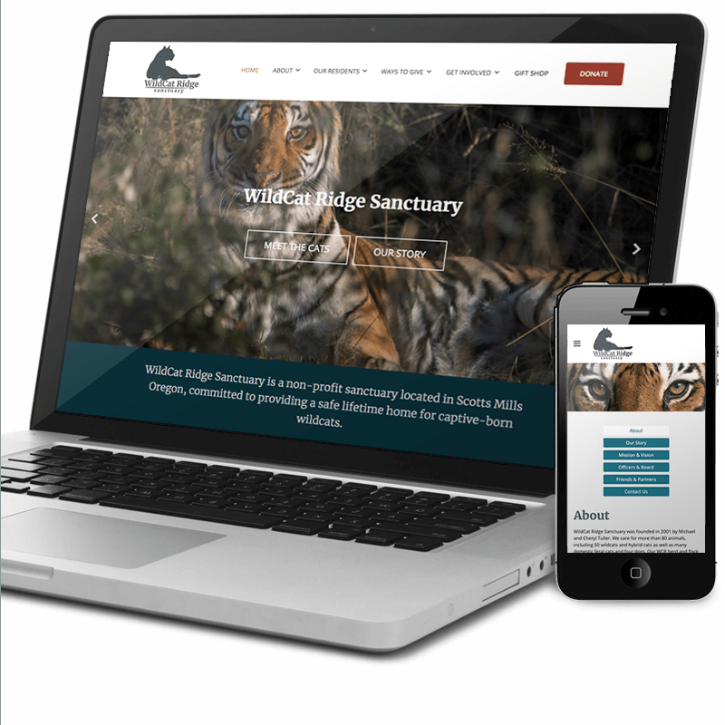
When the founder of WildCat Ridge Sanctuary reached out to me and asked if I would be interested in redesigning the website, I excitedly said yes. Just like most non-profit organizations, the sanctuary doesn’t have a full-time design or marketing resource, and this was a massive opportunity for me to make an impact. I have been a volunteer photographer for a few years and love the mission of this organization. I also thought that my involvement could go beyond website design and potentially touch all areas of their online strategy.Challenge
The current website was slow to load, not responsive, and very difficult to edit. Besides, some areas such as links to social networks, volunteer opportunities, or other ways to make an impact were missing. The biggest challenge, however, was that the website’s donate button linked to a clunky and outdated third-party page. The founder and I established three primary goals: increase donations, attract new followers, and make it easy to add new pages or update existing ones.
Discovery Phase
I started by auditing the current site and identifying user flows. Keeping our primary goals in mind, I proposed a new structure.

Process
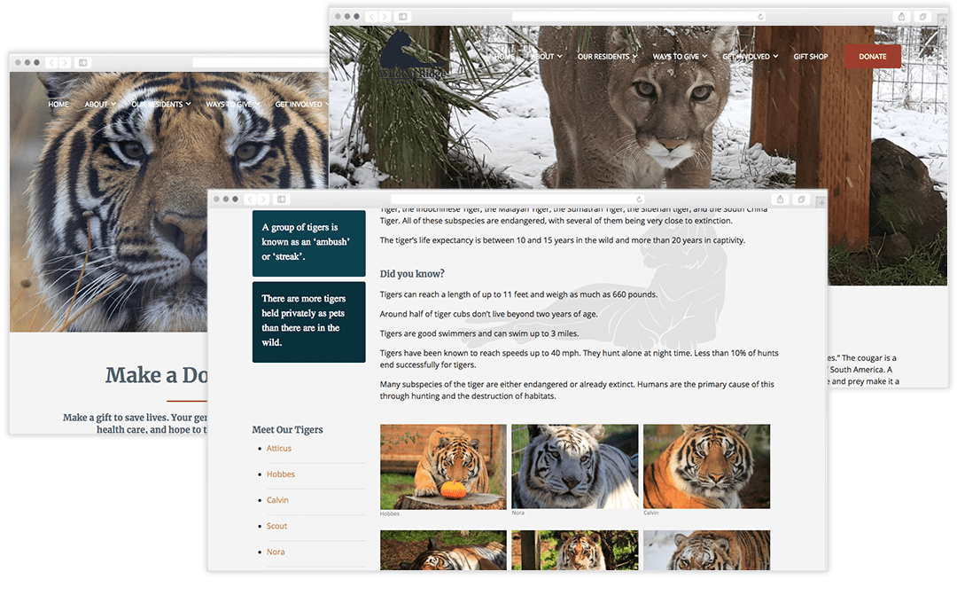
After looking into a few different platforms, WordPress was the best choice. It is flexible enough to accommodate my layout. Using a customizable plugin for donations allows us to keep everything on site. Most of the cat bios already existed, but I needed to create new copy for some of the pages, such as species overview or donations. A friend offered to help, and we have been working together on additional projects.
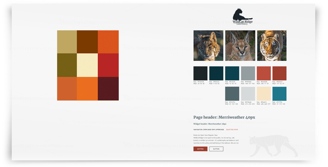
In parallel, I explored color schemes and font styles. The sanctuary is located in Oregon, and we wanted the colors to reflect this. A few ideas included browns and oranges, although we realized that other sanctuaries used a similar palette.
We settled on the dark teals and brick red since it was unique and a nod to the pine trees in Oregon. Merriweather as our primary font, felt friendly, yet bold and modern. I updated the logo to use this font as well, and to ensure brand consistency.
The new style has been used for printed materials such as brochures, flyers, or posters.

In addition to the website, I implemented an online store via Shopify, a YouTube channel, and started to work on a strategy for a monthly sanctuary newsletter.


