Discovery Phase
To design an application that would be adopted, it was important to clearly understand the user. I set up calls with teachers who were currently using our curriculum, to learn more about their challenges and day-to-day activities. Additionally, I visited a few schools to experience the classroom environment first hand.
The application would need to be user-friendly, fast, and follow the same order of steps as the printed materials. The design needed to take into account conditions in the classroom and varying degrees of digital proficiency.

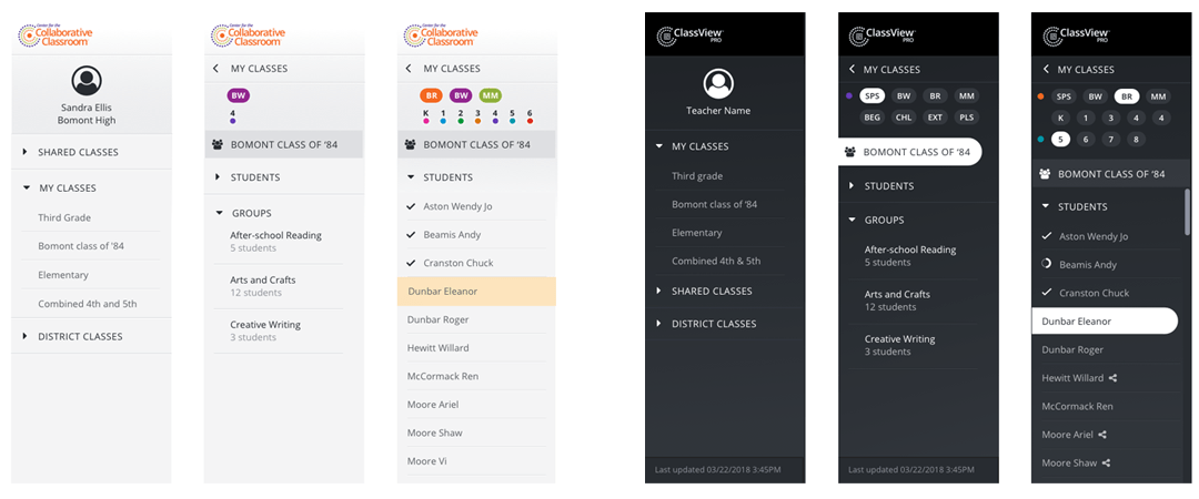
Image courtesy of Center for Collaborative Classroom
Process
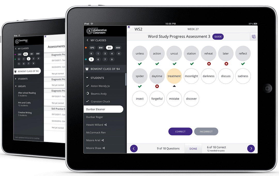
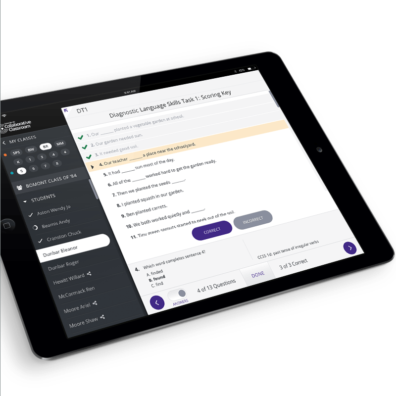
I started by outlining the steps a teacher goes through when teaching the curriculum. This included various classes or group assessments as well as assessing individual students.
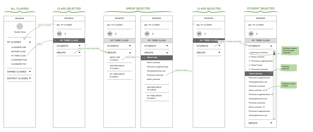
From there, we defined components for each assessment, such as header, footer, and central area. The app had to be flexible to accommodate various states for each area. Once the flow and wireframes were fleshed out, we ran in by a private testing group. These were all seasoned teachers, who deeply understood the material as well as the conditions in the classroom.
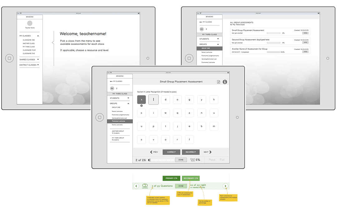
The tests allowed people to provide feedback on the ongoing development of the product, ensuring that the service was designed and developed in line with user expectations.
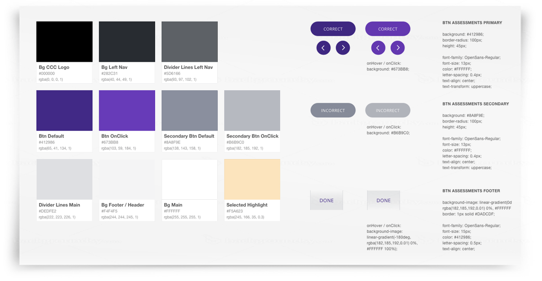
My inspiration for the visual design came from existing apps such as Hulu, Squarespace, or Skype. The navigation of those apps feels intuitive, and we liked the clean, uncluttered visual treatment. The colors and font styles followed an established style guide that was used for all print materials. We explored a light and a dark color scheme for the left navigation, and landed on dark, since it created a higher contrast to the assessment area.
Final Outcome
I introduced Sketch and Zeplin into the workflow, which made handing off designs to the developers very easy. The engineers loved how easy it was for them to find specs, font styles, and reusable components.