UNDECIDABLE LABS
2016 · Mobile, Web · Balsamiq, Photoshop, InVision
The Project
A research tool for larger product purchases.My Role
As the founding member of the company and only designer, I wore many hats. The first few weeks were spent on user research, followed by design strategy and leading brainstorming sessions around different concepts. I developed user flows, wireframes, high-fidelity visual designs, and prototypes that were later handed over to the front-end engineer.Challenge
When people buy high-value products that require complex technical tradeoffs, they often feel stressed and don’t know where to start. Through our research, we have found that a variety of tools (Google search, blog posts, review sites, in-store visits, spreadsheets…) are being used and that it takes about 16 hours of research before consumers make a significant purchase.Discovery Phase
We started by interviewing people to learn more about their purchasing process when it comes to high-value products. What are the steps people go through when they have to buy something that they need (e.g., home appliance, electronics, gear…) but don’t know much about? What tools do they use (online and offline)? How long does it generally take until they feel comfortable making a purchase? And, most importantly, how to people feel throughout the process?

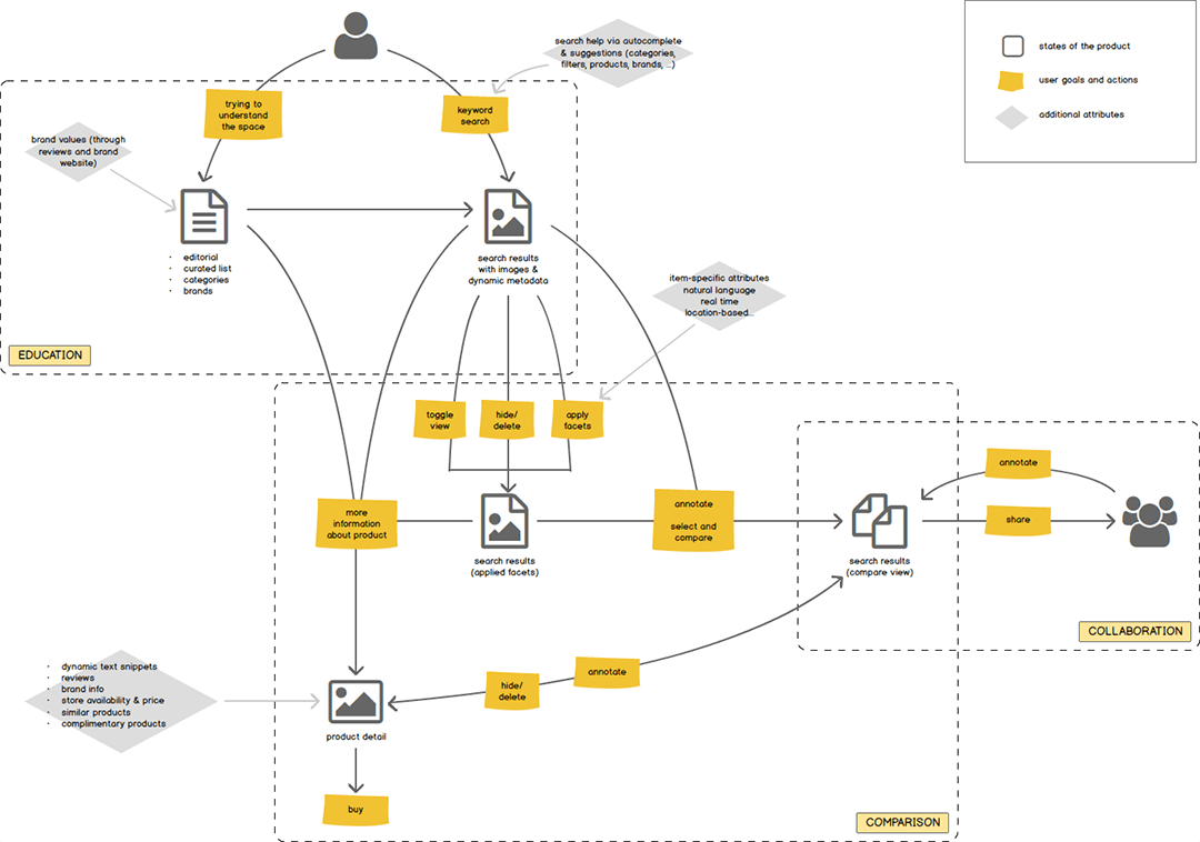
We learned that the purchase process can be broken down into distinctive steps: Education around the product space (what exactly do I need?), understanding what’s out there (I don’t want to miss anything), and narrowing down choices. People want to feel in control throughout the process. Sometimes, they also need to collaborate with another decision-maker.
Process
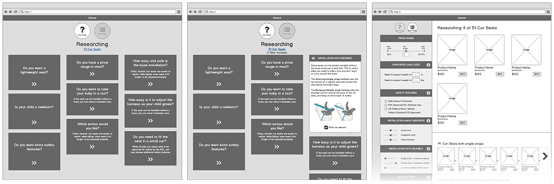
After we had learned about the challenges and user goals, we came up with a variety of concepts. Every Thursday was dedicated to user testing. Earlier in the process, I used paper prototypes to evaluate theories. Later on, I watched as participants used high-fidelity prototypes created in InVision. By testing early and often, we were able to iterate quickly and evaluate ideas on real users.
During user research, we found that people often don’t know what to look for when evaluating a purchase. Some ideas to help with this step were a wizard, a questionnaire, or a card-based UI.
Final Outcome
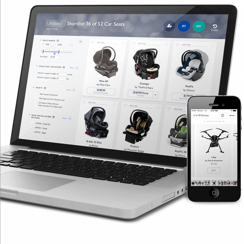
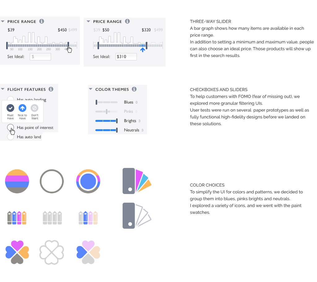
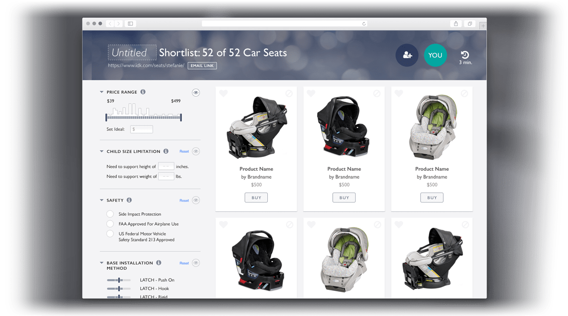
The purchase research tool offers education around the product space and allows customers to customize their shortlist based on individual needs and preferences. By introducing a filtering system that takes “nice to have” and “ideal” into consideration, we make sure that the products are presented in a meaningful way. User tests were run on several paper prototypes as well as fully functional high-fidelity designs before we landed on these solutions. A bar graph shows how many items are available in each price range. In addition to setting a minimum and maximum value, people can also choose an ideal price. Those products will show up first in the search results. To simplify the UI for colors and patterns, we decided to group them into blues, pinks brights, and neutrals. I explored a variety of icons, and we went with paint swatches. Before the company got acquired by Google in 2016, we launched a fully-functional prototype.Mobile
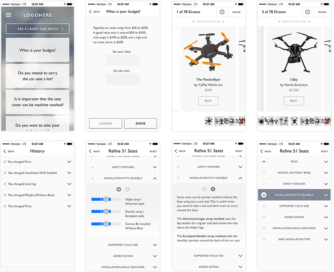
While we initially focused on the desktop experience, we quickly found out that 40% of people were accessing our tool on a mobile device. We realized that there is a much stronger need for a mobile experience as we thought. I came up with the simplified flow and a design optimized for small screens, which helped to tell our story to investors.
